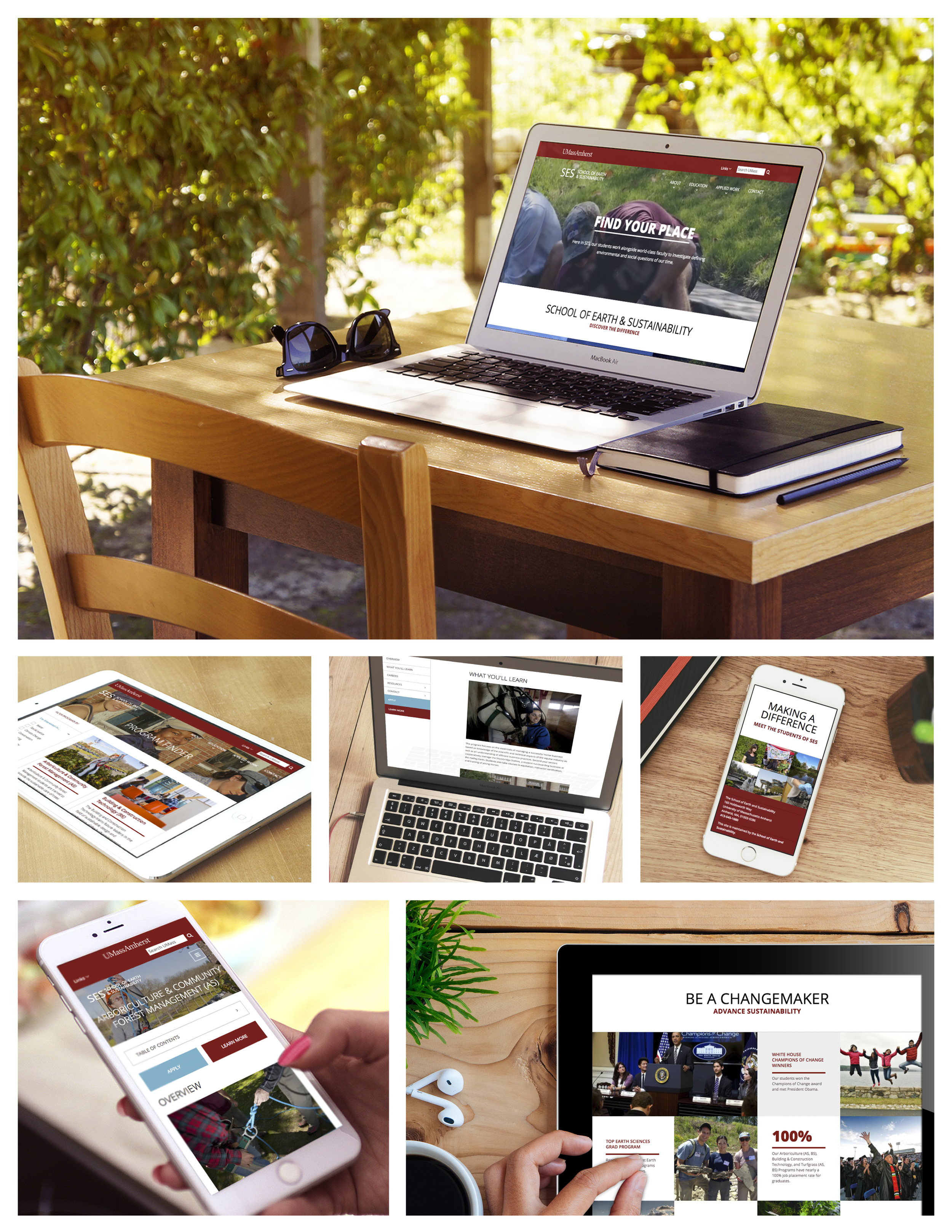
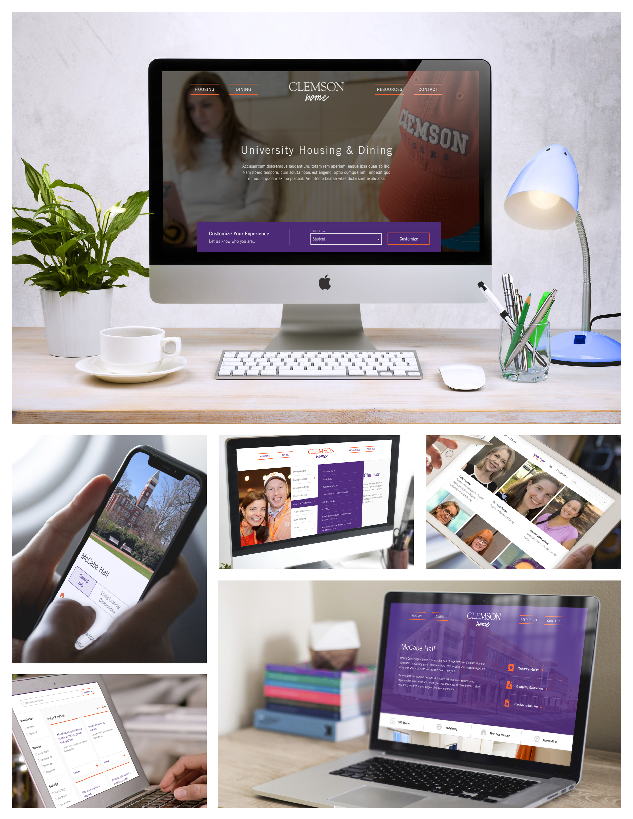
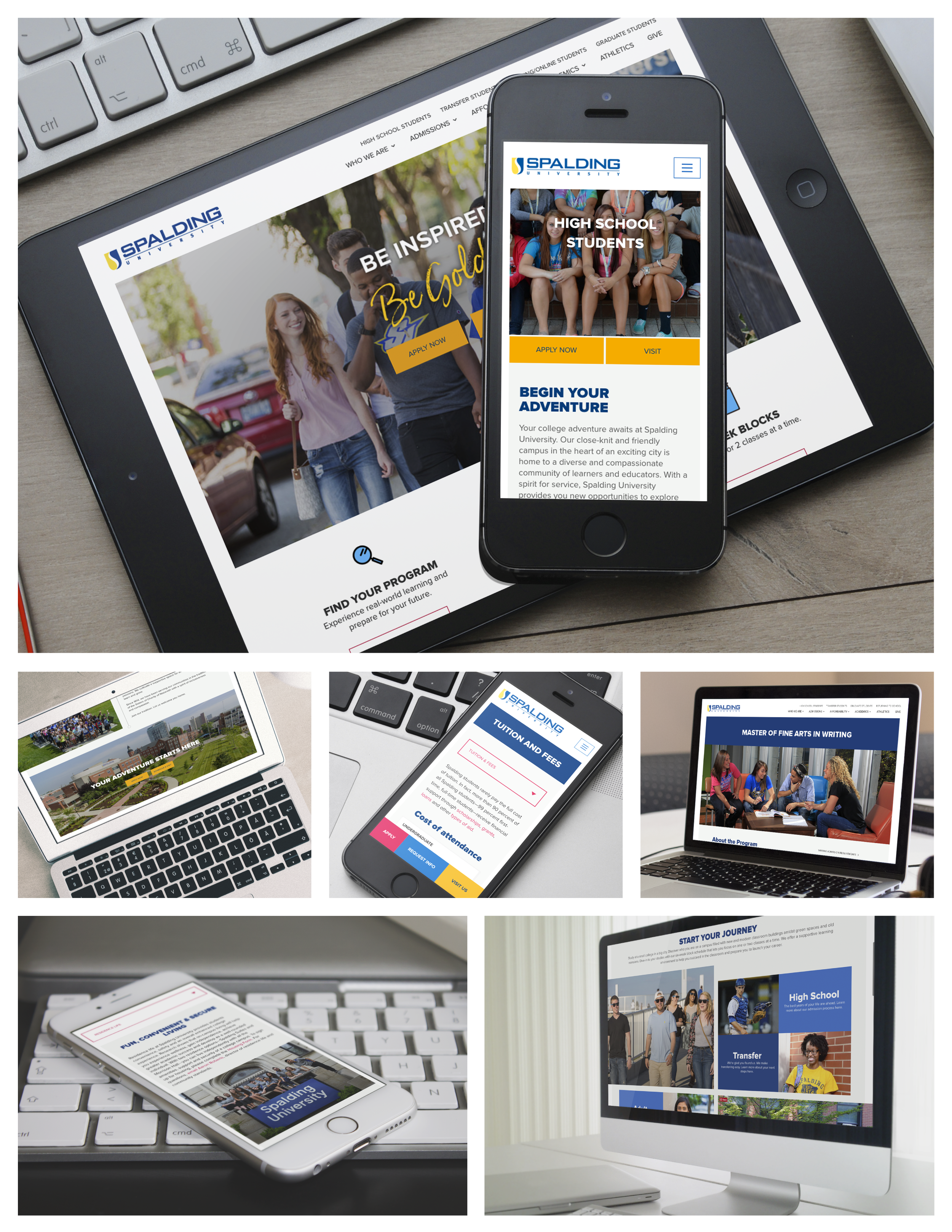
You need a partner who gets higher ed–we’re it.
It’s no secret that the higher education market is shrinking while simultaneously getting turned on its head. It’s also no secret that an institution’s website and digital strategy are critical for driving enrollment, and that right now–if you’re here reading this–yours is probably underutilized.
But we see challenges as opportunities.
We build websites–and they fucking rock.
We’re excited to help you create a fresh and modern website that captures your story, unifies your message, and drives enrollment up!
It’s about achieving your goals in the smartest way possible. It’s about finding the human workflows that work organically, and applying just enough tech to facilitate them on the web.
So that means our job is to focus development in a way that lets both our teams test, try out, revise, track, report, improve, and finally define the right structure and messaging to appeal to all of your audiences.
We’ll tackle usability questions, create a content mapping and migration plan, and utilize rapid prototyping to clarify your path to success. This allows us to test assumptions, identify problems, and change direction quickly with low risk and minimal cost.
Best of all, this allows us to achieve your key goals within your available budget and timeline–even if we don’t do it in the way we all expect going in.


But it’s not just about your website, is it?
BRANDING
Your brand is every piece of your organization, from your logo and fonts to the words you choose in your Tweets, to the navigation items on your website, to the buildings on your campus. #ConsistencyMatters #StandOut
ACCESSIBILITY
Your message doesn't matter if your users can't get to it—from choosing readable fonts and colors to adding text to photos for screen readers and everything in between, make sure you're getting the word out in ways that users can use. #WellDone
PRINT MARKETING & COLLATERAL
Don’t tell us print is dead–it’s not.
SEO
Google is the big player in the SEO game, and they changes the rules quite a lot; what you thought you knew about SEO a year ago may not be true any more. To be truly competitive and successful in the SEO arena, you must be flexible and decisive—focusing on specific individual goals. #GetNoticed
SOCIAL MEDIA
Here's our advice: be strategic about your social media. Craft your messages per platform, track your results, and use data to make decisions about how and where to spend your time. #DontJustDoIt (but DO capitalize each word so the screenreader can read your hashtags!)
ENROLLMENT
Need more bodies in the room for an event or a program? First get the tools in place—the people will come naturally. Pair actionable messaging with analytics, add a side of innovation, top with creativity, and it's a sure win. #SolidStrategy
SECURITY
Last year, organizations spent more than $80 billion on cybersecurity to try and stop the $3 trillion worth of damage cyber crime created. What are you doing to keep your site safe? #RegularSecurityUpdatesAreMandatory #ReputableHostingIsWorthThe$$ #SiteBackupsSaveLivesOrDataAnyway


Did you think we forgot about your content? Not a chance.
Content is HUGE.
That means it often feels overwhelming, unmanageable, untamable, and maybe even a little frightening. So where do you start?
A strategic mindset: know who you are speaking to, be intentional, and create around your know/feel/do.
Documentation & organization: create spreadsheets and editorial calendars to keep you focused, accountable, and on track.
Auditing what you’ve got: mark your content as “keep”/“revise or combine”/“eliminate” while simultaneously making a list of “needs to be created.” This also establishes a baseline for understanding your content needs.
Gateways & destinations: do site visitors “pass through” the page, heading deeper into the site OR do they “hang out” on the page to really absorb your message? Your homepage is a “gateway” that sends visitors on to the content they really need. A blog post is a “destination” that a visitor arrives at and takes their time engaging with.
Your CMS: it’s literally designed for this—leverage its built-in strengths to make your life easier and your content management a breeze.
Together we’ll look at which messages on your site need to stand out the most. We’ll help you refine and present your messages in ways that easily communicate who you are and what you have to offer, structuring content to reach specific audiences on the pages where they are most likely to read it.
You’re the experts in your own institution—your strengths, your values, and your policies; we’re the experts in higher education marketing and communications. Together, we can combine our knowledge and write content to engage your target audiences effectively.
And make no mistake—this will be a collaboration! You have years of knowledge and insider information about your institution, your input is essential to ensure that your new content captures the intricacies of your brand brand, culture, and experience.
With your help, we’ll define the audience, goal, and keyword for each page and turn our expertise to writing SEO-optimized, web-friendly content that attracts your audience on any device.
Ready for story time?
Vermont Technical College
When we first met VTC back in 2013, their website was falling short as a recruitment tool. During our initial discovery sessions, we reviewed their Analytics and discovered that only 28% of visitors were making a second click to get off of the homepage and head deeper into the site. Understandably, both our teams felt confident that number could be significantly improved.
We set out to give the site a visual redesign to make site visitors think, “Wow! This is Vermont Tech?” Fresh off of a rebranding project, we knew VTC was coming to the table with incredibly strong design elements to support this website makeover.
But, good looks aren't enough; the new VTC site also needed to work for their site visitors–we mapped out user personas to understand the key audiences and present the information they wanted, in a straight-forward intuitive way.
We simplified navigation and increased engagement–within a month of going live, 85% of visitors were going deeper into the site.
In 2014, shortly after launching the site, we won an Interactive Media Council Award in the category of "Schools" for the new VTC site.
In 2018 we completed a full-site ADA review and implemented changes to keep them in compliance with AA level standards.
Also in 2018 we did extensive user testing on the primary navigation to understand how visitors were actually using the site.
In 2019 we began the process of redesigning their site as we migrated it from Drupal 7 onto WordPress.
June 15, 2020 the recently updated site went live!
October 2020, the redesigned site won 3 awards, one for user experience.
Our role
Website Design & Development
Content Strategy
Navigation Strategy & Testing
ADA Compliance
Southern New Hampshire University
SNHU–considered visionary in the world of higher education–came to us when their online programs were virtually overflowing with students. #GoodProblemToHave
However, they had spent SO MUCH effort building that piece of their programming that on-campus enrollment was falling; prospective students weren't even sure they COULD take on-campus classes.
Together, we exceeded their on-campus enrollment goals.
Our role
Content Strategy & Development
Navigation Strategy
Stakeholder Alignment
Our Lady Of The Elms College
A Catholic college with a thriving student body and truly supportive educational experience, Elms College struggled against a variety of misconceptions about what they did and who they were. They came to us to revamp their website and showcase their unique story. We gave them a modern look and feel, built on a scalable technology platform, and crafted messaging that highlighted the things that make THEM truly special. #AsStepAbove
Our role
Website Design & Development
Content Strategy & Development
Navigation Strategy
Stakeholder Alignment
Asnuntuck Community College
When we met ACC, their site was dated and hard to use. What they needed was a welcoming website that would attract new students and better support their current students and staff. During our discovery process, we realized they didn't have an online course catalog. #SurpriseFeature.
No problem! Our flexible process allowed us to adjust our priorities and we created a content type to allow staff to easily add, categorize, and update individual courses. #ProblemSolved
Our role
Website Design & Development
Photography
ADA Compliance Certification for the State of Connecticut
Some Other Clients Include
Dartmouth’s Thayer School of Engineering
Smith College
Massachusetts College of Liberal Arts
Trinity College Libraries
Hampshire College
Mount Holyoke College
UMass Amherst (multiple departments)
UMass Boston
Harvard (multiple departments)
Cornell University
Ithaca College
Clemson University
Hillsborough Community College Foundation
Bay Path University
North Dakota State University
Tufts University
Yale (multiple departments)
Landmark College


